Have recent global health gains gone to the poor?

Have recent global gains gone to the poor in developing countries? Or the relatively rich? An answer:

We find that with the exception of HIV prevalence, where progress has, on average, been markedly pro-rich, progress on the MDG health outcome (health status) indicators has, on average, been neither pro-rich nor pro-poor. Average rates of progress are similar among the poorest 40 percent and among the richest 60 percent.

That's Adam Wagstaff, Caryn Bredenkamp, and Leander Buisman in a new article titled "Progress on Global Health Goals: are the Poor Being Left Behind?" (full text here). The answer seems to be "mostly no, sometimes yes", but the exceptions to the trend are as important as the trend itself.

I originally flagged this article to read because Wagstaff is one of the authors, and I drew on a lot of his work for my masters thesis (which looked at trends in global health inequities in Ethiopia). One example is this handy World Bank report (PDF) which is a how-to for creating concentration indexes and other measures of inequality, complete with Stata. A concentration index is essentially a health inequality version of the Gini index: instead of showing the concentration of wealth by wealth, or income by income, you measure the concentration of some measure of health by a measure of wealth or income, often the DHS wealth index since it's widely available.

If your chosen measure of health -- let's say, infant mortality -- doesn't vary by wealth, then you'd graph a straight line at a 45 degree angle -- sometimes called the line of equality. But in most societies the poor get relatively more of a bad health outcome (like mortality) and rather less of good things like access to vaccination. In both cases the graphed line would be a curve that differs from the line of equality, which is called a concentration curve. The further away from the line of equality the concentration curve is, the more unequal the distribution of the health outcome is. And the concentration index is simply twice the area between the two lines (again, the Gini index is the equivalent number when comparing income vs. income). The relationship between the two is illustrated in this example graph from my thesis:

You can also just compare, say, mortality rates for the top and bottom quintiles of the wealth distribution, or comparing the top 1% vs. bottom 99%, or virtually any other division, but all of those measures essential ignore a large amount of information in middle of the distribution, or require arbitrary cutoffs. The beauty of concentration curves and indexes is that they use all available information. An even better approach is to use multiple measures of inequality and see if the changes you see are sensitive to your choice of measures; it's a more a convincing case if they're not.

The new Wagstaff, Bredenkamp, and Buisman paper uses such concentration indexes, and other measures of inequity, to "examine differential progress on health Millennium Development Goals (MDGs) between the poor and the better off within countries." They use a whopping 235 DHS and MICs surveys between 1990-2011, and find the following:

On average, the concentration index (the measure of relative inequality that we use) neither rose nor fell. A rosier picture emerges for MDG intervention indicators: whether we compare rates of change for the poorest 40 percent and richest 60 percent or consider changes in the concentration index, we find that progress has, on average, been pro-poor.

However, behind these broad-brush findings lie variations around the mean. Not all countries have progressed in an equally pro-poor way. In almost half of countries, (relative) inequality in child malnutrition and child mortality fell, but it also increased in almost half of countries, often quite markedly.We find some geographic concentration of pro-rich progress; in almost all countries in Asia, progress on underweight has been pro-rich, and in much of Africa, inequalities in under-five mortality have been growing. Even on the MDG intervention indicators, we find that a sizable fraction of countries have progressed in a pro-rich fashion.

They also compared variations that were common across countries vs. common across indicators -- in other words, to see whether the differences across countries and indicators were because, say, some health interventions are just easier to reach the poorest with, and found that more of the variation came from differences between countries, rather than differences between indicators.

One discussion point they stress is that it's been easier to promote equality in interventions, rather than equality in outcomes, and that part of the story is related to the quality of care that poorer citizens receive. From the discussion:

One hypothesis is that the quality of health care is worse for lower socioeconomic groups; though the poorest 40 percent may have experienced a larger percentage increase in, for example, antenatal visits, they have not observed the same improvement in the survival prospects of their babies. If true, this finding would point to the need for a monitoring framework that captures not only the quantity of care (as is currently the case) but also its quality.

Born in the year of [...]

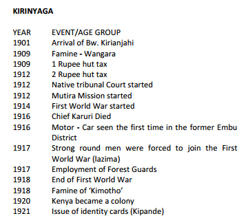
I was looking for the Kenyan 2009 census data and came across that survey's guide for enumerators (ie, data collectors) in PDF form, here. There's an appendix towards the end -- starting on page 60 of the PDF -- that's absolutely fascinating. Collecting information on the age of a population is important for demographic purposes. But what do you do when a large proportion of people don't have birth certificates? The Kenyan census has a list of prominent events from different regions to help connect remembered events to the years in which they happened.

This may well be standard practice for censuses -- I've never worked on one -- but the specific events chosen are interesting nonetheless. Here's the start of the list for Kirinyaga County in Kenya:

So if you know you were born in the year of the famine of (or in?) Wangara, then you were 100 years old in 2009. Likewise, 1917 was notable for being the year that "strong round men were forced to join WWI".

On the same note, the US birth certificate didn't have an option for mother's occupation until 1960! (That and other fascinating history here. Academic take here.) Also, there are 21 extant birth certificates from Ancient Rome.

The Napoleon cohort

I've recently had to think through two problems related to tracking cohorts over time, and each time I've mentally referred back to what is considered by some to be the greatest data visualization of all time. Charles Joseph Minard, an engineer, created the graphic below: "Carte figurative des pertes successives en hommes de l'Armée Française dans la campagne de Russie 1812-1813" (loosely translated as "don't follow Napoleon or anyone else when launching a land war in Asia").

This single picture shows the size of the army as it entered Russia, then the size as it left, their relative geographic location, groups leaving and re-entering the force, and the temperature the army faced as they returned.  And to me it meets one of the main tests for "is this graphic great?" -- it sticks in my head and I find myself referring back to it again and again.

Typhoid counterfactuals

An acquaintance (who doesn't work in public health) recently got typhoid while traveling. She noted that she had had the typhoid vaccine less than a year ago but got sick anyway. Surprisingly to me, even though she knew "the vaccine was only about 50% effective" she now felt that it was  a mistake to have gotten the vaccine. Why? "If you're going to get the vaccine and still get typhoid, what's the point?" I disagreed but am afraid my defense wasn't particularly eloquent in the moment: I tried to say that, well, if it's 50% effective and you and, I both got the vaccine, then only one of us would get typhoid instead of both of us. That's better, right? You just drew the short straw. Or, if you would have otherwise gotten typhoid twice, now you'll only get it once!

These answers weren't reassuring in part because thinking counterfactually -- what I was trying to do -- isn't always easy. Epidemiologists do this because they're typically told ad nauseum to approach causal questions by first thinking "how could I observe the counterfactual?" At one point after finishing my epidemiology coursework I started writing a post called "The Top 10 Things You'll Learn in Public Health Grad School" and three or four of the ten were going to be "think counterfactually!"

A particularly artificial and clean way of observing this difference -- between what happened and what could have otherwise happened -- is to randomly assign people to two groups (say, vaccine and placebo). If the groups are big enough to average out any differences between them, then the differences in sickness you observe are due to the vaccine. It's more complicated in practice, but that's where we get numbers like the efficacy of the typhoid vaccine -- which is actually a bit higher than 50%.

You can probably see where this is going: while the randomized trial gives you the average effect, for any given individual in the trial they might or might not get sick. Then, because any individual is assigned only to the treatment or control, it's hard to pin their outcome (sick vs. not sick) on that alone. It's often impossible to get an exhaustive picture of individual risk factors and exposures so as to explain exactly which individuals will get sick or not in advance. All you get is an average, and while the average effect is really, really important, it's not everything.

This is related somewhat to Andrew Gelman's recent distinction between forward and reverse causal questions, which he defines as follows:

1. Forward causal inference. What might happen if we do X? What are the effects of smoking on health, the effects of schooling on knowledge, the effect of campaigns on election outcomes, and so forth?

2. Reverse causal inference. What causes Y? Why do more attractive people earn more money? Why do many poor people vote for Republicans and rich people vote for Democrats? Why did the economy collapse?

The randomized trial tries to give us an estimate of the forward causal question. But for someone who already got sick, the reverse causal question is primary, and the answer that "you were 50% less likely to have gotten sick" is hard to internalize. As Gelman says:

But reverse causal questions are important too. They’re a natural way to think (consider the importance of the word “Why”) and are arguably more important than forward questions. In many ways, it is the reverse causal questions that lead to the experiments and observational studies that we use to answer the forward questions.

The moral of the story -- other than not sharing your disease history with a causal inference buff -- is that reconciling the quantitative, average answers we get from the forward questions with the individual experience won't always be intuitive.

(Not) knowing it all along

David McKenzie is one of the guys behind the World Bank's excellent and incredibly wonky Development Impact blog. He came to Princeton to present on a new paper with Gustavo Henrique de Andrade and Miriam Bruhn, "A Helping Hand or the Long Arm of the Law? Experimental evidence on what governments can do to formalize firms" (PDF). The subject matter -- trying to get small, informal companies to register with the government -- is outside my area of expertise. But I thought there were a couple methodologically interesting bits: First, there's an interesting ethical dimension, as one of their several interventions tested was increasing the likelihood that a firm would be visited by a government inspector (i.e., that the law would be enforced). From page 10:

In particular, if a firm owner were interviewed about their formality status, it may not be considered ethical to then use this information to potentially assign an inspector to visit them. Even if it were considered ethical (since the government has a right to ask firm owners about their formality status, and also a right to conduct inspections), we were still concerned that individuals who were interviewed in a baseline survey and then received an inspection may be unwilling to respond to a follow-up. Therefore a listing stage was done which did not involve talking to the firm owner.

In other words, all their baseline data was collected without actually talking to the firms they were studying -- check out the paper for more on how they did that.

Second, they did something that could (and maybe should) be incorporated into many evaluations with relative ease. Because findings often seem obvious after we hear them, McKenzie et al. asked the government staff whose program they were evaluating to estimate what the impact would be before the results were in. Here's that section (emphasis added):

A standard question with impact evaluations is whether they deliver new knowledge or merely formally confirm the beliefs that policymakers already have (Groh et al, 2012). In order to measure whether the results differ from what was anticipated, in January 2012 (before any results were known) we elicited the expectations of the Descomplicar [government policy] team as to what they thought the impacts of the different treatments would be. Their team expected that 4 percent of the control group would register for SIMPLES [the formalization program] between the baseline and follow-up surveys. We see from Table 7 that this is an overestimate...

They then expected the communication only group to double this rate, so that 8 percent would register, that the free cost treatment would lead to 15 percent registering, and that the inspector treatment would lead to 25 percent registering.... The zero or negative impacts of the communication and free cost treatments therefore are a surprise. The overall impact of the inspector treatment is much lower than expected, but is in line with the IV estimates, suggesting the Descomplicar team have a reasonable sense of what to expect when an inspection actually occurs, but may have overestimated the amount of new inspections that would take place. Their expectation of a lack of impact for the indirect inspector treatment was also accurate.

This establishes exactly what in the results was a surprise and what wasn't. It might also make sense for researchers to ask both the policymakers they're working with and some group of researchers who study the same subject to give such responses; it would certainly help make a case for the value of (some) studies.

Fun projects are fun

Jay Ulfelder, of the blog Dart-Throwing Chimp, recently wrote a short piece in praise of fun projects. He links to my Hunger Games survival analysis, and Alex Hanna's recent application of survival analysis to a reality TV show, RuPaul's Drag Race. (That single Hunger Games post has accounted for about one-third of the ~100k page views this blog got in the last year!) Jay's post reminded me that I never shared links to Alex's survival analysis, which is a shame, so here goes: First, there's "Lipsyncing for your life: a survival analysis of RuPaul's Drag Race":

I don’t know if this occurs with other reality shows (this is the first I’ve been taken with), but there is some element of prediction involved in knowing who will come out as the winner. A drag queen we spoke with at Plan B suggested that the length of time each queen appears in the season preview is an indicator, while Homoviper’s “index” is largely based on a more qualitative, hermeneutic analysis. I figured, hey, we could probably build a statistical model to know which factors are the most determinative in winning the competition.

And then come two follow-ups, where Alex digs into predictions for the next episode of the current season, and again for the one after that. That last post is a great little lesson on the importance of the proportional hazards assumption.

I strongly agree with this bit from Jay's post about the value of these projects:

Based on personal experience, I’m a big believer in learning by doing. Concepts don’t stick in my brain when I only read about them; I’ve got to see the concepts in action and attach them to familiar contexts and examples to really see what’s going on.

Right on. And in addition to being useful, these projects are, well, fun!

This beautiful graphic is not really that useful

This beautiful infographic from the excellent blog Information is Beautiful has been making the rounds. You can see a bigger version here, and it's worth poking around for a bit. The creators take all deaths from the 20th century (drawing from several sources) and represent their relative contribution with circles:

I appreciate their footnote that says the graphic has "some inevitable double-counting, broad estimation and ball-park figures." That's certainly true, but the inevitably approximate nature of these numbers isn't my beef.

The problem is that I don't think raw numbers of deaths tell us very much, and can actually be quite misleading. Someone who saw only this infographic might well end up less well-informed than if they didn't see it. Looking at the red circles you get the impression that non-communicable and infectious diseases were roughly equivalent in importance in the 20th century, followed by "humanity" (war, murder, etc) and cancer.

The root problem is that mortality is inevitable for everyone, everywhere. This graphic lumps together pneumonia deaths at age 1 with car accidents at age 20, and cancer deaths at 50 with heart disease deaths at 80. We typically don't  (and I would argue should't) assign the same weight to a death in childhood or the prime of life with one that comes at the end of a long, satisfying life.  The end result is that this graphic greatly overemphasizes the importance of non-communicable diseases in the 20th century -- that's the impression most laypeople will walk away with.

A more useful graphic might use the same circles to show the years of life lost (or something like DALYs or QALYs) because those get a bit closer at what we care about. No single number is actually  all that great, so we can get a better understanding if we look at several different outcomes (which is one problem with any visualization). But I think raw mortality numbers are particularly misleading.

To be fair, this graphic was commissioned by Wellcome as "artwork" for a London exhibition, so maybe it should be judged by a different standard...

On regressions and thinking

Thesis: thinking quantitatively changes the way we frame and answer questions in ways we often don't notice. James Robinson, of Acemoglu and Robinson fame (ie, Why Nations Fail@whynationsfailColonial Origins; Reversal of Fortune, and so forth), gave a talk at Princeton last week. It was a good talk, mostly about Why Nations Fail. My main thought during his presentation was that it's simply very difficult to develop a parsimonious theory that covers something as complicated as the long-term economic and political development of the entire world! As Robinson said (quoting someone else), in social science you can say "more and more about less and less, or less and less about more and more."

The talk was followed by some great discussion where several of the tougher questions came from sociologists and political economists. I think it's safe to say that a lot of the skepticism of the Why Nations Fail thesis is centered around the beef that East Asian economics, and especially China, don't fit neatly into it. A&R argue here on their blog -- not to mention in their book, which I've alas only had time to skim -- that China is not an exception to their theory, but I think that impression is still fairly widespread.

But my point isn't about the extent to which China fits into the theory (that's another debate altogether); it's about what it means if or when China doesn't fit into the theory. Is that a major failure or a minor one?  I think different answers to that question are ultimately rooted in a difference of methodological cultures in the social science world.

As social science becomes more quantitative, our default method for thinking about a subject can shift, and we might not even notice that it's happening. For example, if your main form of evidence for a theory is a series of cross-country regressions, then you automatically start to think of countries as the unit of analysis, and, importantly, as being more or less equally weighted. There are natural and arguably inevitable reasons why this will be the case: states are the clearest politicoeconomic units, and even if they weren't they're simply the unit for which we have the most data. While you might (and almost certainly should!) weight your data points by population if you were looking at something like health or individual wealth or well-being, it makes less sense when you're talking about country-level phenomena like economic growth rates. So you end up seeing a lot of arguments made with scatterplots of countries and fitted lines -- and you start to think that way intuitively.

When we switch back to narrative forms of thinking, this is less true: I think we all agree that all things being equal a theory that explains everything except Mauritius is better than a theory that explains everything except China. But it's a lot harder to think intuitively about these things when you have a bunch of variables in play at the same time, which is one reason why multiple regressions are so useful. And between the extremes of weighting all countries equally and weighting them by population are a lot of potentially more reasonable ways of balancing the two concerns, that unfortunately would involve a lot of arbitrary decisions regarding weighting...

This is a thought I've been stewing on for a while, and it's reinforced whenever I hear the language of quantitative analysis working its way into qualitative discussions -- for instance, Robinson said at one point that "all that is in the error term," when he wasn't actually talking about a regression. I do this sort of thing too, and don't think there's anything necessarily wrong with it -- until there is.  When questioned on China, Robinson answered briefly and then transitioned to talking about the Philippines, rather than just concentrating on China. If the theory doesn't explain China (at least to the satisfaction of many), a nation of 1.3 billion, then explaining a country of 90 million is less impressive. How impressive you find an argument depends in part on the importance you ascribe to the outliers, and that depends in part on whether you were trained in the narrative way of thinking, where huge countries are hugely important, or the regression way of thinking, where all countries are equally important units of analysis.

[The first half of my last semester of school is shaping up to be much busier than expected -- my course schedule is severely front-loaded -- so blogging has been intermittent. Thus I'll try and do more quick posts like this rather than waiting for the time to flesh out an idea more fully.]

Why did HIV decline in Uganda?

That's the title of an October 2012 paper (PDF) by Marcella Alsan and David Cutler, and a longstanding, much-debated question in global health circles . Here's the abstract:

Uganda is widely viewed as a public health success for curtailing its HIV/AIDS epidemic in the early 1990s. To investigate the factors contributing to this decline, we build a model of HIV transmission. Calibration of the model indicates that reduced pre-marital sexual activity among young women was the most important factor in the decline. We next explore what led young women to change their behavior. The period of rapid HIV decline coincided with a dramatic rise in girls' secondary school enrollment. We instrument for this enrollment with distance to school, conditional on a rich set of demographic and locational controls, including distance to market center. We find that girls' enrollment in secondary education significantly increased the likelihood of abstaining from sex. Using a triple-difference estimator, we find that some of the schooling increase among young women was in response to a 1990 affirmative action policy giving women an advantage over men on University applications. Our findings suggest that one-third of the 14 percentage point decline in HIV among young women and approximately one-fifth of the overall HIV decline can be attributed to this gender-targeted education policy.

This paper won't settle the debate over why HIV prevalence declined in Uganda, but I think it's interesting both for its results and the methodology. I particularly like the bit on using distance from schools and from market center in this way, the idea being that they're trying to measure the effect of proximity to schools while controlling for the fact that schools are likely to be closer to the center of town in the first place.

The same paper was previously published as an NBER working paper in 2010, and it looks to me as though the addition of those distance-to-market controls was the main change since then. [Pro nerd tip: to figure out what changed between two PDFs, convert them to Word via pdftoword.com, save the files, and use the 'Compare > two versions of a document' feature in the Review pane in Word.]

Also, a tip of the hat to Chris Blattman, who earlier highlighted Alsan's fascinating paper (PDF) on TseTse flies. I was impressed by the amount of biology in the tsetse fly paper; a level of engagement with non-economic literature that I thought was both welcome and unusual for an economics paper. Then I realized it makes sense given that the author has an MD, an MPH, and a PhD in economics. Now I feel inadequate.

Alwyn Young just broke your regression

Alwyn Young -- the same guy whose paper carefully accounting for growth in East Asian was popularized by Krugman and sparked an enormous debate -- has been circulating a paper on African growth rates. Here's the 2009 version (PDF) and October 2012 version. The abstract of the latter paper:

Measures of real consumption based upon the ownership of durable goods, the quality of housing, the health and mortality of children, the education of youth and the allocation of female time in the household indicate that sub-Saharan living standards have, for the past two decades, been growing about 3.4 to 3.7 percent per annum, i.e. three and a half to four times the rate indicated in international data sets. (emphasis added)

The Demographic and Health Surveys are large-scale nationally-representative surveys of health, family planning, and related modules that tend to ask the same questions across different countries and over large periods of time. They have major limitations, but in the absence of high-quality data from governments they're often the best source for national health data. The DHS doesn't collect much economic data, but they do ask about ownership of certain durable goods (like TVs, toilets, etc), and the answers to these questions are used to construct a wealth index that is very useful for studies of health equity -- something I'm taking advantage of in my current work. (As an aside, this excellent report from Measure DHS (PDF) describes the history of the wealth index.)

What Young has done is to take this durable asset data from many DHS surveys and try to estimate a measure of GDP growth from actually-measured data, rather than the (arguably) sketchier methods typically used to get national GDP numbers in many African countries. Not all countries are represented at any given point in time in the body of DHS data, which is why he ends up with a very-unbalanced panel data set for "Africa," rather than being able to measure growth rates in individual countries. All the data and code for the paper are available here.

Young's methods themselves are certain to spark ongoing debate (see commentary and links from Tyler Cowen and Chris Blattman), so this is far from settled -- and may well never be. The takeaway is probably not that Young's numbers are right so much as that there's a lot of data out there that we shouldn't trust very much, and that transparency about the sources and methodology behind data, official or not, is very helpful. I just wanted to raise one question: if Young's data is right, just how many published papers are wrong?

There is a huge literature on cross-country growth 's empirics. A Google Scholar search for "cross-country growth Africa" turns up 62,400 results. While not all of these papers are using African countries' GDPs as an outcome, a lot of them are. This literature has many failings which have been duly pointed out by Bill Easterly and many others, to the extent that an up-and-coming economist is likely to steer away from this sort of work for fear of being mocked. Relatedly, in Acemoglu and Robinson's recent and entertaining take-down of Jeff Sachs, one of their insults criticisms is that Sachs only knows something because he's been running "kitchen sink growth regressions."

Young's paper just adds more fuel to that fire. If African GDP growth has been 3 1/2 to 4 times greater than the official data says, then every single paper that uses the old GDP numbers is now even more suspect.

Bad pharma

Ben Goldacre, author of the truly excellent Bad Science, has a new book coming out in January, titled Bad Pharma: How Drug Companies Mislead Doctors and Harm Patients Goldacre published the foreword to the book on his blog here. The point of the book is summed up in one powerful (if long) paragraph. He says this (emphasis added):

So to be clear, this whole book is about meticulously defending every assertion in the paragraph that follows.

Drugs are tested by the people who manufacture them, in poorly designed trials, on hopelessly small numbers of weird, unrepresentative patients, and analysed using techniques which are flawed by design, in such a way that they exaggerate the benefits of treatments. Unsurprisingly, these trials tend to produce results that favour the manufacturer. When trials throw up results that companies don’t like, they are perfectly entitled to hide them from doctors and patients, so we only ever see a distorted picture of any drug’s true effects. Regulators see most of the trial data, but only from early on in its life, and even then they don’t give this data to doctors or patients, or even to other parts of government. This distorted evidence is then communicated and applied in a distorted fashion. In their forty years of practice after leaving medical school, doctors hear about what works through ad hoc oral traditions, from sales reps, colleagues or journals. But those colleagues can be in the pay of drug companies – often undisclosed – and the journals are too. And so are the patient groups. And finally, academic papers, which everyone thinks of as objective, are often covertly planned and written by people who work directly for the companies, without disclosure. Sometimes whole academic journals are even owned outright by one drug company. Aside from all this, for several of the most important and enduring problems in medicine, we have no idea what the best treatment is, because it’s not in anyone’s financial interest to conduct any trials at all. These are ongoing problems, and although people have claimed to fix many of them, for the most part, they have failed; so all these problems persist, but worse than ever, because now people can pretend that everything is fine after all.

If that's not compelling enough already, here's a TED talk on the subject of the new book:

Hunger Games critiques

My Hunger Games survival analysis post keeps getting great feedback. The latest anonymous comment:

Nice effort on the analysis, but the data is not suitable for KM and Cox. In KM, Cox and practically almost everything that requires statistical inference on a population, your variable of interest should be in no doubt independent from sample unit to sample unit.

Since your variable of interest is life span during the game where increasing ones chances in a longer life means deterring another persons lifespan (i.e. killing them), then obviously your variable of interest is dependent from sample unit to sample unit.

Your test for determining whether the gamemakers rig the selection of tributes is inappropriate, since the way of selecting tributes is by district. In the way your testing whether the selection was rigged, you are assuming that the tributes were taken as a lot regardless of how many are taken from a district. And the way you computed the expected frequency assumes that the number of 12 year olds equals the number of 13 year olds and so on when it is not certain.

Thanks for the blog. It was entertaining.

And there's a lot more in the other comments.

Another type of mystification

A long time ago (in years, two more than the product of 10 and the length of a single American presidential term) John Siegfried wrote this First Lesson in Econometrics (PDF). It starts with this:

Every budding econometrician must learn early that it is never in good taste to express the sum of the two quantities in the form: "1 + 1 = 2".

... and just goes downhill from there. Read it.

(I wish I remembered where I first saw this so I could give them credit.)

Why we should lie about the weather (and maybe more)

Nate Silver (who else?) has written a great piece on weather prediction -- "The Weatherman is Not a Moron" (NYT) -- that covers both the proliferation of data in weather forecasting, and why the quantity of data alone isn't enough. What intrigued me though was a section at the end about how to communicate the inevitable uncertainty in forecasts:

...Unfortunately, this cautious message can be undercut by private-sector forecasters. Catering to the demands of viewers can mean intentionally running the risk of making forecasts less accurate. For many years, the Weather Channel avoided forecasting an exact 50 percent chance of rain, which might seem wishy-washy to consumers. Instead, it rounded up to 60 or down to 40. In what may be the worst-kept secret in the business, numerous commercial weather forecasts are also biased toward forecasting more precipitation than will actually occur. (In the business, this is known as the wet bias.) For years, when the Weather Channel said there was a 20 percent chance of rain, it actually rained only about 5 percent of the time.

People don’t mind when a forecaster predicts rain and it turns out to be a nice day. But if it rains when it isn’t supposed to, they curse the weatherman for ruining their picnic. “If the forecast was objective, if it has zero bias in precipitation,” Bruce Rose, a former vice president for the Weather Channel, said, “we’d probably be in trouble.”

My thought when reading this was that there are actually two different reasons why you might want to systematically adjust reported percentages ((ie, fib a bit) when trying to communicate the likelihood of bad weather.

But first, an aside on what public health folks typically talk about when they talk about communicating uncertainty: I've heard a lot (in classes, in blogs, and in Bad Science, for example) about reporting absolute risks rather than relative risks, and about avoiding other ways of communicating risks that generally mislead. What people don't usually discuss is whether the point estimates themselves should ever be adjusted; rather, we concentrate on how to best communicate whatever the actual values are.

Now, back to weather. The first reason you might want to adjust the reported probability of rain is that people are rain averse: they care more strongly about getting rained on when it wasn't predicted than vice versa. It may be perfectly reasonable for people to feel this way, and so why not cater to their desires? This is the reason described in the excerpt from Silver's article above.

Another way to describe this bias is that most people would prefer to minimize Type II Error (false negatives) at the expense of having more Type I error (false positives), at least when it comes to rain. Obviously you could take this too far -- reporting rain every single day would completely eliminate Type II error, but it would also make forecasts worthless. Likewise, with big events like hurricanes the costs of Type I errors (wholesale evacuations, cancelled conventions, etc) become much greater, so this adjustment would be more problematic as the cost of false positives increases. But generally speaking, the so-called "wet bias" of adjusting all rain prediction probabilities upwards might be a good way to increase the general satisfaction of a rain-averse general public.

The second reason one might want to adjust the reported probability of rain -- or some other event -- is that people are generally bad at understanding probabilities. Luckily though, people tend to be bad about estimating probabilities in surprisingly systematic ways! Kahneman's excellent (if too long) book Thinking, Fast and Slow covers this at length. The best summary of these biases that I could find through a quick Google search was from Lee Merkhofer Consulting:

 Studies show that people make systematic errors when estimating how likely uncertain events are. As shown in [the graph below], likely outcomes (above 40%) are typically estimated to be less probable than they really are. And, outcomes that are quite unlikely are typically estimated to be more probable than they are. Furthermore, people often behave as if extremely unlikely, but still possible outcomes have no chance whatsoever of occurring.

The graph from that link is a helpful if somewhat stylized visualization of the same biases:

In other words, people think that likely events (in the 30-99% range) are less likely to occur than they are in reality, that unlike events (in the 1-30% range) are more likely to occur than they are in reality, and extremely unlikely events (very close to 0%) won't happen at all.

My recollection is that these biases can be a bit different depending on whether the predicted event is bad (getting hit by lightning) or good (winning the lottery), and that the familiarity of the event also plays a role. Regardless, with something like weather, where most events are within the realm of lived experience and most of the probabilities lie within a reasonable range, the average bias could probably be measured pretty reliably.

So what do we do with this knowledge? Think about it this way: we want to increase the accuracy of communication, but there are two different points in the communications process where you can measure accuracy. You can care about how accurately the information is communicated from the source, or how well the information is received. If you care about the latter, and you know that people have systematic and thus predictable biases in perceiving the probability that something will happen, why not adjust the numbers you communicate so that the message -- as received by the audience -- is accurate?

Now, some made up numbers: Let's say the real chance of rain is 60%, as predicted by the best computer models. You might adjust that up to 70% if that's the reported risk that makes people perceive a 60% objective probability (again, see the graph above). You might then adjust that percentage up to 80% to account for rain aversion/wet bias.

Here I think it's important to distinguish between technical and popular communication channels: if you're sharing raw data about the weather or talking to a group of meteorologists or epidemiologists then you might take one approach, whereas another approach makes sense for communicating with a lay public. For folks who just tune in to the evening news to get tomorrow's weather forecast, you want the message they receive to be as close to reality as possible. If you insist on reporting the 'real' numbers, you actually draw your audience further from understanding reality than if you fudged them a bit.

The major and obvious downside to this approach is that people know this is happening, it won't work, or they'll be mad that you lied -- even though you were only lying to better communicate the truth! One possible way of getting around this is to describe the numbers as something other than percentages; using some made-up index that sounds enough like it to convince the layperson, while also being open to detailed examination by those who are interested.

For instance, we all the heat index and wind chill aren't the same as temperature, but rather represent just how hot or cold the weather actually feels. Likewise, we could report some like "Rain Risk" or "Rain Risk Index" that accounts for known biases in risk perception and rain aversion. The weather man would report a Rain Risk of 80%, while the actual probability of rain is just 60%. This would give us more useful information for the recipients, while also maintaining technical honesty and some level of transparency.

I care a lot more about health than about the weather, but I think predicting rain is a useful device for talking about the same issues of probability perception in health for several reasons. First off, the probabilities in rain forecasting are much more within the realm of human experience than the rare probabilities that come up so often in epidemiology. Secondly, the ethical stakes feel a bit lower when writing about lying about the weather rather than, say, suggesting physicians should systematically mislead their patients, even if the crucial and ultimate aim of the adjustment is to better inform them.

I'm not saying we should walk back all the progress we've made in terms of letting patients and physicians make decisions together, rather than the latter withholding information and paternalistically making decisions for patients based on the physician's preferences rather than the patient's. (That would be silly in part because physicians share their patients' biases.) The idea here is to come up with better measures of uncertainty -- call it adjusted risk or risk indexes or weighted probabilities or whatever -- that help us bypass humans' systematic flaws in understanding uncertainty.

In short: maybe we should lie to better tell the truth. But be honest about it.

When randomization is strategic

Here's a quote from Tom Yates on his blog Sick Populations about a speech he heard by Rachel Glennerster of J-PAL:

Glennerster pointed out that the evaluation of PROGRESA, a conditional cash transfer programme in Mexico and perhaps the most famous example of randomised evaluation in social policy, was instigated by a Government who knew they were going to lose the next election. It was a way to safeguard their programme. They knew the next Government would find it hard to stop the trial once it was started and were confident the evaluation would show benefit, again making it hard for the next Government to drop the programme. Randomisation can be politically advantageous.

I think I read this about Progresa / Oportunidades before but had forgotten it, and thus it's worth re-sharing. The way in which Progresa was randomized (different areas were stepped into the program, so there was a cohort of folks who got it later than others, but all the high need areas got it within a few years) made this more politically feasible as well. I think this situation, in which a government institutes a study of a program to keep it alive through subsequent changes of government, will probably be a less common tactic than its opposite, in which a government designs an evaluation of a popular program that a) it thinks doesn't work, b) it wants to cut, and c) the public otherwise likes, just to prove that it should be cut -- but only time will tell.

A misuse of life expectancy

Jared Diamond is going back and forth with Acemoglu and Robinson over his review of their new book, Why Nations Fail. The exchange is interesting in and of itself, but I wanted to highlight one passage from Diamond's response:

The first point of their four-point letter is that tropical medicine and agricultural science aren’t major factors shaping national differences in prosperity. But the reasons why those are indeed major factors are obvious and well known. Tropical diseases cause a skilled worker, who completes professional training by age thirty, to look forward to, on the average, just ten years of economic productivity in Zambia before dying at an average life span of around forty, but to be economically productive for thirty-five years until retiring at age sixty-five in the US, Europe, and Japan (average life span around eighty). Even while they are still alive, workers in the tropics are often sick and unable to work. Women in the tropics face big obstacles in entering the workforce, because of having to care for their sick babies, or being pregnant with or nursing babies to replace previous babies likely to die or already dead. That’s why economists other than Acemoglu and Robinson do find a significant effect of geographic factors on prosperity today, after properly controlling for the effect of institutions.

I've added the bolding to highlight an interpretation of what life expectancy means that is wrong, but all too common.

It's analagous to something you may have heard about ancient Rome: since life expectancy was somewhere in the 30s, the Romans who lived to be 40 or 50 or 60 were incredibly rare and extraordinary. The problem is that life expectancy -- by which we typically mean life expectancy at birth -- is heavily skewed by infant mortality, or deaths under one year of age. Once you get to age five you're generally out of the woods -- compared to the super-high mortality rates common for infants (less than one year old) and children (less than five years old). While it's true that there were fewer old folks in ancient Roman society, or -- to use Diamond's example -- modern Zambian society, the difference isn't nearly as pronounced as you might think given the differences in life expectancy.

Does this matter? And if so, why? One area where it's clearly important is Diamond's usage in the passage above: examining the impact of changes in life expectancy on economic productivity. Despite the life expectancy at birth of 38 years, a Zambian male who reaches the age of thirty does not just have eight years of life expectancy left -- it's actually 23 years!

Here it's helpful to look at life tables, which show mortality and life expectancy at different intervals throughout the lifespan. This WHO paper by Alan Lopez et al. (PDF) examining mortality between 1990-9 in 191 countries provides some nice data: page 253 is a life table for Zambia in 1999. We see that males have a life expectancy at birth of just 38.01 years, versus 38.96 for females (this was one of the lowest in the world at that time). If you look at that single number you might conclude, like Diamond, that a 30-year old worker only has ~10 years of life left. But the life expectancy for those males remaining alive at age 30 (64.2% of the original birth cohort remains alive at this age) is actually 22.65 years. Similarly, the 18% of Zambians who reach age 65, retirement age in the US, can expect to live an additional 11.8 years, despite already having lived 27 years past the life expectancy at birth.

These numbers are still, of course, dreadful -- there's room for decreasing mortality at all stages of the lifespan. Diamond's correct in the sense that low life expectancy results in a much smaller economically active population. But he's incorrect when he estimates much more drastic reductions in the economically productive years that workers can expect once they reach their economically productive 20s, 30s, and 40s.

----

[Some notes: 1. The figures might be different if you limit it to "skilled workers" who aren't fully trained until age 30, as Diamond does; 2. I'm also assumed that Diamond is working from general life expectancy, which was similar to 40 years total, rather than a particular study that showed 10 years of life expectancy at age 30 for some subset of skilled workers, possibly due to high HIV prevalence -- that seems possible but unlikely; 3. In these Zambia estimates, about 10% of males die before reaching one year of age, or over 17% before reaching five years of age. By contrast, between the ages of 15-20 only 0.6% of surviving males die, and you don't see mortality rates higher than the under-5 ones until above age 85!; and 4. Zambia is an unusual case because much of the poor life expectancy there is due to very high HIV/AIDS prevalence and mortality -- which actually does affect adult mortality rates and not just infant and child mortality rates. Despite this caveat, it's still true that Diamond's interpretation is off. ]

The great quant race

My Monday link round-up included this Big Think piece asking eight young economists about the future of their field. But, I wanted to highlight the response from Justin Wolfers:

Economics is in the midst of a massive and radical change.  It used to be that we had little data, and no computing power, so the role of economic theory was to “fill in” for where facts were missing.  Today, every interaction we have in our lives leaves behind a trail of data.  Whatever question you are interested in answering, the data to analyze it exists on someone’s hard drive, somewhere.  This background informs how I think about the future of economics.

Specifically, the tools of economics will continue to evolve and become more empirical.  Economic theory will become a tool we use to structure our investigation of the data.  Equally, economics is not the only social science engaged in this race: our friends in political science and sociology use similar tools; computer scientists are grappling with “big data” and machine learning; and statisticians are developing new tools.  Whichever field adapts best will win.  I think it will be economics.  And so economists will continue to broaden the substantive areas we study.  Since Gary Becker, we have been comfortable looking beyond the purely pecuniary domain, and I expect this trend towards cross-disciplinary work to continue.

I think it's broadly true that economics will become more empirical, and that this is a good thing, but I'm not convinced economics will "win" the race. This tracks somewhat with the thoughts from Marc Bellemare that I've linked to before: his post on "Methodological convergence in the social sciences" is about the rise of mathematical formalism in social sciences other than economics. This complements the rise of empirical methods, in the sense that while they are different developments, both are only possible because of the increasing mathematical, statistical, and coding competency of researchers in many fields. And I think the language of convergence is more likely to represent what will happen (and what is already happening), rather than the language of a "race."

We've already seen an increase in RCTs (developed in medicine and epidemiology) in economics and political science, and the decades ahead will (hopefully) see more routine serious analysis of observational data in epidemiology and other fields (in the sense that the analysis is more careful about causal inference), and  advanced statistical techniques and machine learning methodologies will become commonplace across all fields as researchers deal with massive, complex longitudinal datasets gleaned not just from surveys but increasingly from everyday collection.

Economists have a head start in that their starting pool of talent is generally more mathematically competent than other social sciences' incoming PhD classes. But, switching back to the "race" terminology, economics will only "win" if -- as Wolfers speculates will happen -- it can leverage theory as a tool for structuring investigation. My rough impression is that economic theory does play this role, sometimes, but it has also held empirical investigation in economics back at times, perhaps through publication bias (see on minimum wage) against empirical results that don't fit the theory, and possibly more broadly through a general closure of routes of investigation that would not occur to someone already trained in economic theory.

Regardless, I get the impression that if you want to be a cutting-edge researcher in any social science you should be beefing up not only your mathematical and statistical training, but also your coding practice.

Update: Stevenson and Wolfers expand their thoughts in this excellent Bloomberg piece. And more at Freakonomics here.

Mimicking success

If you don't know what works, there can be an understandable temptation to try to create a picture that more closely resembles things that work. In some of his presentations on the dire state of student learning around the world, Lant Pritchett invokes the zoological concept of isomorphic mimicry: the adoption of the camouflage of organizational forms that are successful elsewhere to hide their actual dysfunction. (Think, for example, of a harmless snake that has the same size and coloring as a very venomous snake -- potential predators might not be able to tell the difference, and so they assume both have the same deadly qualities.) For our illustrative purposes here, this could mean in practice that some leaders believe that, since good schools in advanced countries have lots of computers, it will follow that, if computers are put into poor schools, they will look more like the good schools. The hope is that, in the process, the poor schools will somehow (magically?) become good, or at least better than they previously were. Such inclinations can nicely complement the "edifice complex" of certain political leaders who wish to leave a lasting, tangible, physical legacy of their benevolent rule. Where this once meant a gleaming monument soaring towards the heavens, in the 21st century this can mean rows of shiny new computers in shiny new computer classrooms.

That's from this EduTech post by Michael Trucano. It's about the recent evaluations showing no impact from the One Laptop per Child (OLPC) program, but I think the broader idea can be applied to health programs as well. For a moment let's apply it to interventions designed to prevent maternal mortality. Maternal mortality is notoriously hard to measure because it is -- in the statistical sense -- quite rare. While many 'rates' (which are often not actual rates, but that's another story) in public health are expressed with denominators of 1,000 (live births, for example), maternal mortality uses a denominator of 100,000 to make the numerators a similar order of magnitude.

That means that you can rarely measure maternal mortality directly -- even with huge sample sizes you get massive confidence intervals that make it difficult to say whether things are getting worse, staying the same, or improving. Instead we typically measure indirect things, like the coverage of interventions that have been shown (in more rigorous studies) to reduce maternal morbidity or mortality. And sometimes we measure health systems things that have been shown to affect coverage of interventions... and so forth. The worry is that at some point you're measuring the sort of things that can be improved -- at least superficially -- without having any real impact.

All that to say: 1) it's important to measure the right thing, 2) determining what that 'right thing' is will always be difficult, and 3) it's good to step back every now and then and think about whether the thing you're funding or promoting or evaluating is really the thing you care about or if you're just measuring "organizational forms" that camouflage the thing you care about.

(Recent blog coverage of the OLPC evaluations here and here.)

Stats lingo in econometrics and epidemiology

Last week I came across an article I wish I'd found a year or two ago: "Glossary for econometrics and epidemiology" (PDF from JSTOR, ungated version here) by Gunasekara, Carter, and Blakely. Statistics is to some extent a common language for the social sciences, but there are also big variations in language that can cause problems when students and scholars try to read literature from outside their fields. I first learned epidemiology and biostatistics at a school of public health, and now this year I'm taking econometrics from an economist, as well as other classes that draw heavily on the economics literature.

Friends in my economics-centered program have asked me "what's biostatistics?" Likewise, public health friends have asked "what's econometrics?" (or just commented that it's a silly name). In reality both fields use many of the same techniques with different language and emphases. The Gunasekara, Carter, and Blakely glossary linked above covers the following terms, amongst others:

  • confounding
  • endogeneity and endogenous variables
  • exogenous variables
  • simultaneity, social drift, social selection, and reverse causality
  • instrumental variables
  • intermediate or mediating variables
  • multicollinearity
  • omitted variable bias
  • unobserved heterogeneity

If you've only studied econometrics or biostatistics, chances are at least some of these terms will be new to you, even though most have roughly equivalent forms in the other field.

Outside of differing language, another difference is in the frequency with which techniques are used. For instance, instrumental variables seem (to me) to be under-used in public health / epidemiology applications. I took four terms of biostatistics at Johns Hopkins and don't recall instrumental variables being mentioned even once! On the other hand, economists just recently discovered randomized trials. (Now they're more widely used) .

But even within a given statistical technique there are important differences. You might think that all social scientists doing, say, multiple linear regression to analyze observational data or critiquing the results of randomized controlled trials would use the same language. In my experience they not only use different vocabulary for the same things, they also emphasize different things. About a third to half of my epidemiology coursework involved establishing causal models (often with directed acyclic graphs)  in order to understand which confounding variables to control for in a regression, whereas in econometrics we (very!) briefly discussed how to decide which covariates might cause omitted variable bias. These discussions were basically about the same thing, but they differed in terms of language and in terms of emphasis.

I think an understanding of how and why researchers from different fields talk about things differently helps you to understand the sociology and motivations of each field.  This is all related to what Marc Bellemare calls the ongoing "methodological convergence in the social sciences." As research becomes more interdisciplinary -- and as any applications of research are much more likely to require interdisciplinary knowledge -- understanding how researchers trained in different academic schools think and talk will become increasingly important.