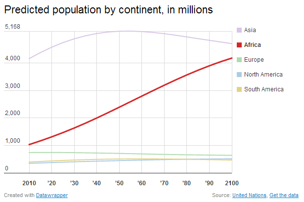
Max Fisher has a piece in the Washington Post presenting "The amazing, surprising, Africa-driven demographic future of the Earth, in 9 charts". While he notes that the numbers are "just projections and could change significantly under unforeseen circumstances" the graphs don't give any sense of the huge uncertainty involved in projecting trends out 90 years in the future. Here's the first graph:
The population growth in Africa here is a result of much higher fertility rates, and a projected slower decline in those rates.
But those projected rates have huge margins of error. Here's the total fertility rate, or "the average number of children that would be born to a woman over her lifetime" for Nigeria, with confidence intervals that give you a sense of just how little we know about the future:

That's a lot of uncertainty! (Image from here, which I found thanks to a commenter on the WaPo piece.)
It's also worth noting that if you had made similar projections 87 years ago, in 1926, it would have been hard to anticipate World War II, hormonal birth control, and AIDS, amongst other things.
