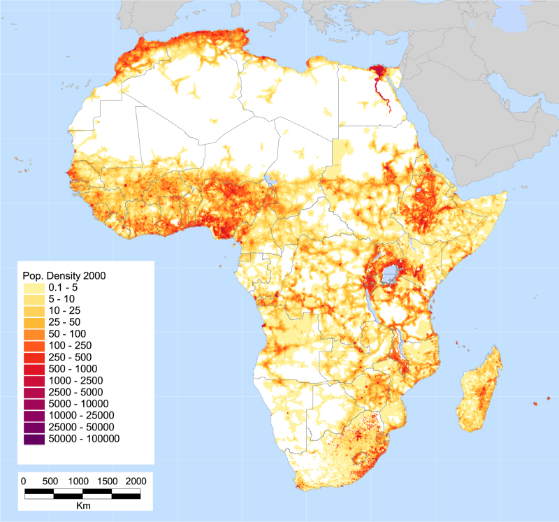
I was recently struck by differences in population density: Northern Nigeria's Kano state has an official population of ~10 million, whereas the entire country of Zambia has 13.5. Zambia's land area, meanwhile, is also about 35 times that of Kano. So I started looking around for a nice map of population density in Africa. The best I found was this one via UNEP:
And here's a higher resolution version.
Some of the most striking concentrations are along the Mediterranean coast, the Nile basin, the Ethiopian plateau, and around Lake Victoria. (I'd love to track down the data behind this map but haven't had time.)
A good map can change how you think. If you're used to seeing maps that have country-level estimates of disease prevalence, for instance, you miss variations at the subnational level. This is often for good reason, as the subnational data is often even spottier than the national estimates. But another thing you miss is a sense of absolute population numbers, because looking at a map it's much easier to see countries by their areas rather than their populations, which for matters of health and other measures of human well-being is generally what we care about. There are some cool maps that do this but they inevitably lose their geographic accuracy.
