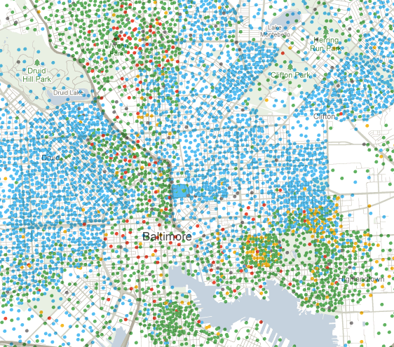
The New York Times has a new interactive feature up, called Mapping America: Every City, Every Block. It uses "local data from the Census Bureau's American Community Survey, based on samples from 2005 to 2009." The data includes income and education levels by census tract, which is interesting but not that visually stimulating, and the more striking data on race by household in each census tract. Areas with higher population density are typically easier to work with -- try New York City for starters. My current home, Baltimore, makes a great test case. On these maps, each circle represents 50 households. (As you zoom further out, you start seeing counties instead of census tracks, and each dot represents many more households.) A screenshot:
By race, blue = black, green = white, red = Asian, yellow = Hispanic.
For those unfamiliar with Baltimore, that's the Inner Harbor at the bottom. As you can see, the neighborhoods just southwest (Federal Hill) and north (Canton, Fells Point) of the harbor are predominantly white. The relatively sparsely populated section in the center is the more commercial downtown. East and West Baltimore are predominantly black. The green (ie, white) strip in the center is Mt. Vernon, whereas the area at the center top with more green (white) and red (Asian) includes the Charles Village neighborhood, where Hopkins' Homewood undergraduate campus is located.
The Johns Hopkins medical campus, including the School of Public Health where I'm a student, is in the predominantly blue (black) area on the middle right of the map above.
One thing that struck me as odd at first is that there are a bunch of green dots (ie, white households) in the middle of Patterson Park, the big green space included in this zoomed in map:
On further thought, I think the maps are showing averages of the data from the entire census tract. The tract that includes Patterson Park also includes some surrounding blocks, which are predominantly white. The distribution of differently colored dots on the map represents the race breakdown within that tract, but the location of the dots within the tract on this map is completely random. If you play with the tool, you'll find that tracts are highlighted when you mouseover them, and that the spacing of dots within the tract is uniform -- this also accounts for the sudden changes in density you see in some places at the edges between tracts.
Finally, below is a closeup of the area I live in. At the top center of this map is Charles Village (including the Hopkins undergraduate campus). I live near 25th street, which bisects this map horizontally, in the transition between the predominantly white and Asian area in Charles Village and the mostly black neighborhoods in between Mt. Vernon and Charles Village:
h/t @edwardcarr


